A (unromantic) love letter to Tennis TV
Photo by Josephine Gasser on Unsplash
The ATP Tour is already underway this year ahead of the Australian Open with Rafa taking home the title in Melbourne — giving him a record breaking 19 consecutive seasons with a title. Given the title of this article you’d be forgiven for thinking that I am a lifelong tennis uber-fan, nourished by an impressive junior tennis career or some kind of personal excellence on the court. The reality is that I:
- almost exclusively spank my first serve into the net
- am thrilled with a rally over 10 fairly wobbly ground strokes
However, since Tennis TV (the official YouTube channel for the ATP Tour) waltzed into my life last year I now watch tennis almost daily. This article is an attempt to understand why I find the medium of ‘YouTube highlights’ so compelling for a sport I’m not even that interested in. As usual the process will be to completely over-engineer the idea and in the process justify upp-ing my YouTube ‘app time limit’ on my phone.
Highlights allow you to keep up with the story of the season
Context matters — something that became very apparent to me with football. I know very little about football, just enough to know if a team is more likely to win the English Premier League or get relegated. But context is what splits the following two opinions between myself and my mates watching the same footie game:
- two sub-par teams struggling to string 5 passes together in a currently goal-less draw
- an epic season-ending relegation battle between 2 teams known for their ‘gritty style’
The same is true in tennis. Just as Match Of The Day enables football fans to keep up with the story of the season and associated battles, daily YouTube highlights spanning multiple matches gives the same opportunity to tennis fans. Which is helpful, because following tennis is starting to require a bit more effort.
The story of a tennis season used to be easy to follow
The emergence and then dominance of the ‘Big 3’ meant that previously following tennis didn’t require much — it required following 3 players (Djokovic, Federer and Nadal) and consequentially only 3 head-to-head rivalries. This might sound like a bit of an exaggeration, but in the last 18 years (2004–2021) they have won 59 of the 71 Grand Slams — that’s more than 4 in every 5 matches with 8 of those years being completely dominated by them.
Given such dominance, and hence determinism when it comes to which players will feature in the ‘big matches’, there really wasn’t any need to follow the rest of the season. This is changing. With Djokovic’s dominance starting to be challenged by the new crop (Medvedev, Zverev etc) there isn’t quite the same small set of players that are asserting anywhere close to similar dominance.
With 3 players comes 3 head-to-heads to follow — this is just a statement of the Binomial Coefficient — “3 choose 2”. With 8 players comes 28, and with 20 players this grows quite rapidly to 190. As dominance slips at the top of the game the amount of tennis to watch to keep up with the story of the season grows very fast. You’ve got to start watching a lot of tennis to prevent ending up watching a Grand Slam semi and struggling to pronounce two ‘unknowns’ names. Highlights make this easier to follow by catching a glimpse of the last 8 matches of a tournament in a cool slick cool cool sub 10 min edit.
However this then begs the real question: even if you could watch all that tennis, would you want to? As much as I love getting settled in for a bit of sport, for me the answer is a resounding no.
Most of tennis isn’t tennis
Most of a tennis match is not actually players knocking the ball back and forth between them. Now this isn’t necessarily a tennis specific issue and plagues other sports as well (most notably the overly statistical-ised American sports), but is worth bearing in mind. In fact, it’s estimated that only 17.5% of a tennis match is with the ball actually in play — something corroborated by this reddit thread (reddit only being beaten in credibility by Wiki). A lot of time is spent:
- changing ends
- breaks between games
- breaks between service points
- bathroom breaks
- more bathroom breaks
This has only been exacerbated since the start of the pandemic with players having to fetch their own towels between points.
Most of tennis that is tennis is not ‘exciting tennis’
Just like most of the points in this article, most of those in tennis just aren’t that interesting. Hopefully this isn’t that controversial a statement, but even if so this is where I’ll try to completely over-engineer the problem to demonstrate the point. To do so requires a definition of what makes a point ‘exciting’ in tennis. For me, it’s one (or preferably a combination) of:
- it contains a flare shot (scorching winner, tweener, some other sikkkkk skill or any Dimitrov backhand — skip to 1:02 for a treat)
- it contains a long rally preferably with a bit of momentum swing
- it matters
Now the first 2 are hard to measure, however by definition will be scarce in any given tennis match. Both are defined relative to average (‘flare’ and ‘long’) and so by definition they will be few and far between — so if that’s what you are after then highlights are for you anyway.
The last point is more easily quantifiable — how much a point matters could be thought of as how much it affects your chances of winning the whole match (not just this given game or set). And in order to quantify ‘chances’ we need a model.
Point-based Modelling
We have an intuitive understanding of which points matter the most in a game. Match points are pretty important. So are set points. Also tie breaks as a whole and standard break points. What makes these points interesting (and also exist at all) is the discretisation of the scoring system in tennis. Arguably the scoring system is what elevates tennis as a whole to be exciting. If we didn’t discretise the scoring in tennis, then something akin to the Law of Large Numbers (LLN) would kick in and make it a fairly boring affair. This is because if we simply had a race to 100 points then the slightly better player would always win — something that can be mathematically proved with the ‘Problem of Points’.
To stick a quick bit of maths behind this statement let’s introduce ‘points-based modelling’ (much too clever to be an original idea of mine). The theory in a nutshell is this:
- two players play tennis,
aandb - each serves and returns
- give each of them a probability that they win any given point on their serve {
p_a,p_b} and hence prob of winning when returning is {(1 - p_b),(1 - p_a)} - now write an algorithm for the rules of tennis and simulate each point according to who is serving using the above probabilities
- let the algorithm run through the rules of tennis as each point randomly is simulated until the rules dictate the match is over
As an example, if I give both players 100% chance to win their own serve (i.e. p_a = p_b = 1.0) then we would simulate with a serving first:
awins 4 straight points to win the first game (1-0)bwins 4 straight points to win the second game (1-1)awins 4 straight points to win the third game (2-1)- etc etc
Once we introduce a bit of randomness with 0 < {p_a, p_b} < 1, then we get more interesting results but the process is the same - simulate each point and the algorithm will play through the match until we end up with a winner.
Now we have a model, what can we do with it?
As usual for ‘small enough’ problems we have 2 ways to work out the probability of something happening:
- brute force: simulate from a given starting point in a tennis match a load of matches and count the number of times
awins and then divide by the total number of matches simulated to get the probability thatawins - closed form: derive a formula to express the win probability from any given starting point
Fortunately for time reasons, we can use the latter. The theory here relies heavily on combinatorics and due to the back and forth nature of tennis (service game, return game, service game etc.) along with the tiebreak it gets a bit fiddly. Luckily it’s quite simply explained here and here and I’ve packaged it all up into a simple python packed called tennisim.
Given this, we can then do the following:
- simulate a load of tennis matches (to keep things simple without much loss we can just sim with
p_a = p_b) - at each point in the match, churn out the probability that player
awill win the match according to our points-based model
Great but what does this probability have to do with exciting tennis points?
Just as we can think of a point as completely inconsequential if it doesn’t change our overall chance of winning the whole match (like the losing team being given a penalty in football when they are 10–0 down), we can think of ‘exciting points’ as points that change the probability that we win the match by a lot. As mentioned above, these are likely to be:
- match points
- set points (when the set is close)
- tiebreaks (when the set is already close by definition)
- break points
In other words, all the points that only exist because tennis has a discretised scoring system. So if our probability of winning changes by a lot on a given point then that is probably an exciting point to watch.
Let’s simulate some matches
Let’s start by simulating 1,000 matches for each pair of probabilities {p_a, p_b} where for simplicity we set p_a = p_b.

Image by author. Output Dataframe where each row corresponds to a point in a simulated match.
Before trying to do anything fancy, let’s first have a look at the data to see if things make sense. Let’s take 25 of the matches for each ‘probability pair’ {p_a, p_b} and plot how the probability series play out throughout the match. We should expect them to:
- start at 50/50 (as we set our players to be equally good at the start i.e.
p_a = p_b) - end at either 1 or 0 as player
aeither eventually wins (1) or loses the match (0) - fluctuate fairly smoothly throughout
- fluctuate by maximum 0.5 at any point (this 0.5 occurring only in final set tiebreak or final game deuce)
Let’s bin the points so we can plot based on percentage of the way through a match instead of absolute point counts (as each match will differ slightly) and then plot them.
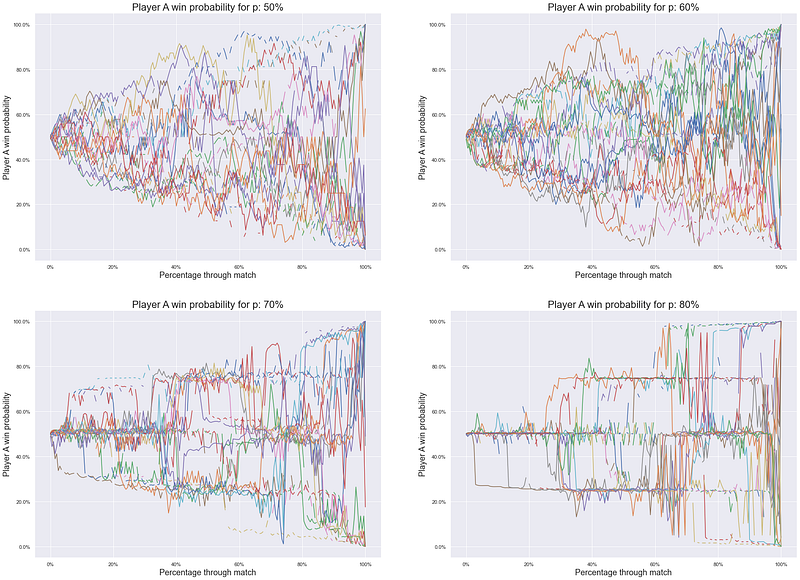
Image by author
So what are we looking at?
- as expected all paths start at 50/50 and head toward player
aeither winning (100%) or losing (0%) - quite clearly the paths for 50% are more ‘random walk’-esque than those for 80% which appear to jump around a bit — with some points for 80% jumping from 50% to 0%/100% at the very end
- matches for 60% and 70% sit somewhere in-between as the paths become more largely deterministic with some large jumps
As an immediate observation we can hypothesise the following:
“If players are relatively better at serving then it seems like most of the match is not very consequential (read: not interesting) with relatively few points determining the overall outcome of the match”
Before getting into why, let’s try to make this sound a bit more convincing by:
- trying to use statistics to put the above statement into numbers
- trying to use fancy sounding words to sound more compelling
What does the distribution of ‘probability change’ look like?
Given that we are now about to look at a ‘meta distribution’ i.e. the probability distribution where the underlying variable is a probability itself, let’s simplify things by renaming ‘probability chg’ (the fluctuations in the above graph) as ‘interest’. Now we can:
- take first differences of the above lines on the graph to get the ‘interest’ of each point
- plot them per probability pair
{p_a, p_b}
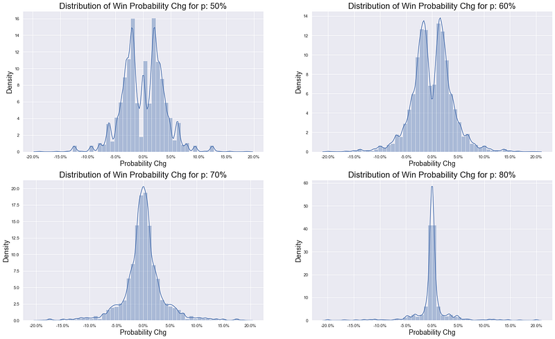
Image by author
So when we don’t look at each match as a time series (and just look cross-sectionally across all points for each {p_a, p_b} pair), it seems like in matches where players win more of their own service points there are more points that have little impact on the game - displayed above by the tighter and tighter distributions around 0%, where 0% represents a completely inconsequential point.
However given we have eradicated the time series element what we might be masking in the bottom right distribution is:
- most
p_a = p_b = 80%matches are incredibly boring with zero interesting points - some
p_a = p_b = 80%matches are incredibly epic and contain all the interesting points in the tails of the distribution
To check this we can then look at:
- computing match specific stats (computing stats within each time series)
- averaging these match specific stats across the matches for ease (or just displaying their distributions to get the more complete picture)
Let’s have a look at variance
Given the above distributions look pretty bell shaped, although increasingly fat tailed, looking at the variance of win probability can be a helpful measure. First let’s look at the total variance of win probability per match, averaged over all matches of a given service probability pair:
df_res[['p_a', 'p_b', 'match_id', 'prob_chg']].groupby(['p_a', 'p_b', 'match_id']).var().groupby(['p_a', 'p_b']).mean().rename(columns={'prob_chg':'Var(Prob Chg)'})
Image by author
Interesting. A pretty dimensionless quantity but the trend is clear. Despite what we say above, it appears that that the matches that previously looked ‘boring’ actually generate more variance in win probability. However we have neglected a few things:
- where this variance occurs: it’s possible that all the variance occurs at the end of a match and so you have to watch the full match in order to get the good stuff
- how many points make up most of the variance: as per above, it seems like the
p_a = p_b = 80%games seem to be largely dominated by a few large deviations
To get some insight into this we can do the following:
- within each match, rank the points by the size of their ‘interest’ (the change of win probability)
- compute the variance per match
- compute the contribution of the top
npoints to that variance (where if we took all points that would provide 100% of the variance) - average these percentage contributions across all matches of a given probability pair

Image by author
What does the above graph show?
- on the far left, we can see that for
p_a = p_b = 50%, the ‘most interesting point’ makes up less than 10% of the total interest whereas forp_a = p_b = 80%we are closer to 25% - on the far right we can see that for
p_a = p_b = 80%, almost 80% of all variation is explained just by the 10 biggest points
In other words, whilst these matches do have more variance, that variance is highly concentrated amongst a select few points with the remainder of the game not having much impact.
Why? Why is this the case?
In the extreme case, we can think of p_a = p_b = 100% - each player wins every point on their serve with certainty. Setting aside the fact that the game would never finish (you’d be locked in the first set tiebreak forever), it illustrates the limit of the above. Each set would comprise of 12 completely pointless games leading with certainty to a tiebreak with the whole set decided there. With p_a = p_b = 80% it is not quite as extreme as this, but it is on it’s way there. In fact, the probability of winning a given service game with 80% chance of winning any given point is 98%.
Even if you are 1 point down in your service game (i.e. 0–15) with an 80% chance of winning a point on your serve, you still have a 93% chance of eventually winning the game. What this means is much of a set is pretty boring — in colloquial terms, it’s just ‘serve-bots’ raining down aces/un-returnables for 12 games straight until you get to 6–6 and then the whole set is decided in the tiebreak. Or, one of the serve-bots has a momentary malfunction and is broken (very unlikely but can happen) in which case the set is almost certainly over and will finish 6–4 — yet again with only 1 brief moment of ‘interest’. As per all of the above this is forgetting trick shots and epic rallies — however with more and more points starting increasingly unevenly (better serves) these are less likely to occur as well.
So ATM where is the ATP?
Given all the above it feels like a bit of a leading question. To come out and say we are in the p_a = p_b = 50% scenario would really scramble my overly laboured point that YouTube highlights is the way forward for keeping up with the game.
The answer is somewhere around 65–70% but this is looking like it will continue to rise in line with the height of the top players. Let’s provide a bit of data behind that statement rather than dumping it out un-verified. We can make use of the database compiled by Jeff Sackmann that powers his stats-heavy tennis website tennisabstract as well as the amazing blog ‘Heavy Topspin’ he runs here. The raw data files can be found here. Let’s pull the data in and have a look at the average tennis player height through time.
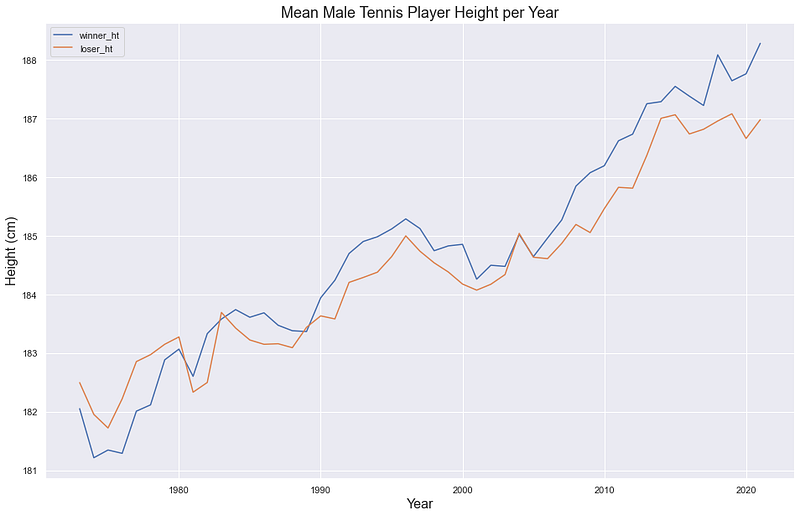
Image by author
So quite a clear trend over the last 50 years since the early 1970s when the database starts. Why? Because they serve better — and serving is your one shot (one opportunity) to start the point on the front foot. No more so is this height trend exhibited than the current top 4. Setting aside Djokovic at 6’2”, the following 3 — all part of the new crop of players — stand at:
- Medvedev 6’6”
- Zverev 6’6”
- Tsitipas 6’4”
To demonstrate this relationship between height and service prowess, we can use some data — something that Jeff showed himself in 2017 here. Again, using Jeff’s data we can look at how some common serve metrics are correlated with height. These metrics are:
- SGW: % of service games won
- SPW: % of service points won (this is our
{p_a, p_b}in the above model) - 1stSPW: % of 1st service points won
- AceRate: % of serves which are aces
To compute these, instead of just looking at every single ATP match in the database, we want to ensure that some players who have been around for a while don’t skew our stats too much. In other words, if we have one freakishly good 5’9” server who plays every single ATP match over the course of 10 years, then this player will have a disproportionate impact when we are interested in the average relationship between height and these stats.
To combat this, we will make use of a concept widely used in baseball called ‘Seasonal Age’. 25 is widely used in baseball but we can have a look at the average age of the tennis players in our sample to determine what age is most appropriate.
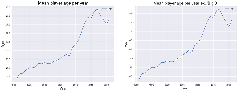
Image by author
So it seems like even excluding the ‘Big 3’ the average ATP player is also getting older. Looking at the above, let’s use 27 as the age we will base the below metrics on. Before we can compute them, let’s check what our height distribution looks like and if we need to bin our heights.

Image by author
Strangely it looks like the only thing worse for being an ATP player than being 175cm (5’9”) is being 181cm or 186cm. In reality it’s probably just a data issue. Let’s ‘fix it’ by bucketing our height data so that we end up with the below smoother distribution. We’ll also bucket the tails.
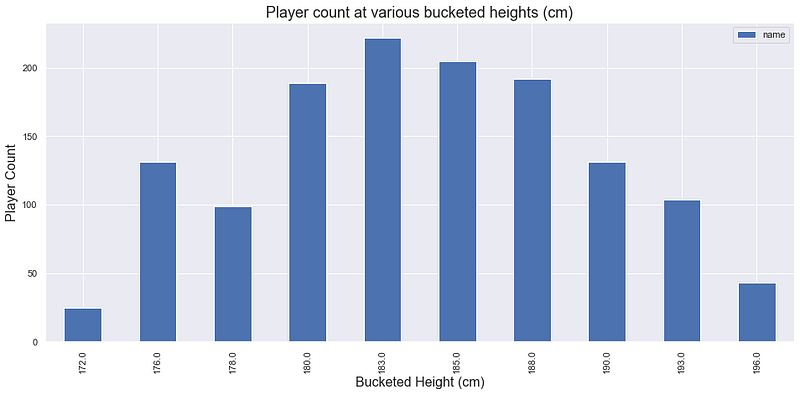
Image by author
Finally let’s select our ‘age-27 season’ data and compute our service stats.

Image by author
The above 4 plots show the relationship between height and our metrics with each metric showing just how important height is for serving dominance. R-squared’s have also been calculated showing that on average 90–95% of the variation in each metric can be explained by height. Compelling.
Wrap it up please
So — what have we shown?
- just as with other sports, highlights provide a good way to keep up with the story of a season — something that is becoming more important with the ‘dominance dilution’ currently occurring in male tennis
- most of tennis is not spent playing tennis
- most of the time spent playing tennis can be inconsequential tennis, but the extent to which this is true depends on player service ability
- the average service ability of players on the ATP Tour isn’t that troubling currently, but as the trend to taller and taller top flight pros continues even more of a given tennis match will contain pretty ‘boring’ points
And with that I feel completely justified to continue my morning routine of devouring anything that Tennis TV will put in front of me. Especially this. And this. And this as well. I mean it’s all good stuff you should pop on over.